
Wing Shya is a Hong Kong based photographer (schooled at the Emily Carr Institute in Canada for four years), who also runs a design studio called Shya-la-la Workshop. Beginning with 1997’s Happy Together to 2046, Wing is best known as the exclusive still photographer and graphic designer for director Wong Kar-wai’s films and projects, which examine time, memory, nostalgia, missed connections, and melancholy. While his primary contribution is shooting publicity stills for the director’s films, Wing, through his studio, also produces special edition books, compact disc chapbooks, postcards, and posters, which allow one to relive Wong’s films—in effect reinterpreting those films in print. My appreciation of Wing’s work for Wong is that they are both presenting a modern image of the Chinese as hip, complex, sophisticated, glamorous, and contemporary, showing us that the Chinese are just as fascinating in their own way as the rest of us.
Wing’s first involvement with Wong was a poster he designed for Chungking Express (1994), a film that finds hip citizens of Hong Kong, falling in and out of love. The poster is a collage of different characters that capture their celluloid moods along with objects and moments from the film. The poster immediately elicits intrigue derived from the situations and attitude of the narrative. By choosing collage, Wing accomplishes the dual feat of communicating different aspects of the film as well as designing a strikingly bold layout. He uses yellow type to set apart the text information from the images, but it also compliments the photos. The torn edges of the character photos symbolize their individual hipness that is the badge of youth.
Happy Together (1997) is Wing and Wong next film, which produced a photo book, two different versions of compact disc packaging, and Shya’s graphic design and photography, which found its way onto some international posters. Wing shot with AGFA film stock, using Fuji mid-format cameras with auto-focus along with snapshot cameras. His decision to use these tools captures the complexity of two Chinese gay men’s dreamy melancholy as they fall in and out of love during their stay in Buenos Aires. Green is one of the symbolizing colors, along with the murky saturated look of other colors (such as brown and red), which capture the sadness of tears. The sepia color tone of some images in the Happy Together book conveys the passage of time, and the mementos of the two characters’ travels recorded and kept in this personal diary of sorts. Wing achieved some of these effects by staining the prints with coffee sometimes or bathing the prints for about a month. Also, the collage of photo scraps conveys the intimacy of personal experience. The film was released in 1997, which parallels the year the British transferred Hong Kong back to China. This was a watershed year for modern Hong Kong culture and identity. The world certainly knew Hong Kong was under British rule but had a vague association of who these people are. In Happy Together, Wing portrays these characters as rootless exiles who are emotionally complex.
In the Mood for Love (2000) is the third project that Wing, once again, designed a photo book, two different compact disc packages, and his photography was on most of the international posters. The film nostalgically revisits Hong Kong’s recent past of the early 1960s about two neighbors who discover their spouses are having an affair with each other. The two neighbors decide to investigate how the affair started and how it thrived through role-playing. Nostalgia is a key theme, and red (a traditional Chinese color tied to passion) symbolizes it as though scorching an impression on to memory. Hong Kong looks just as modern as Las Vegas of that era, yet uniquely Chinese. Modern loneliness of uprooted young married couples moving to a cosmopolitan city, such as Hong Kong, is captured. The surface glamour of the new class of working professionals and their possessions are motifs that Wing and Wong incorporate into the imagery, which show a glamorous and sophisticated but lonely side of the early 1960s’ Hong Kong lifestyle. Wing created the compact disc release as an LP format booklet. He emphasizes red as the expressive color of repressed desire and crops the main characters into legs and torsos, emphasizing the mystique of role-playing an illicit extramarital affair yet not wanting to be caught. For the photo book, Wing photographs in tight close-ups and crops set in bedrooms or hotels that the young neighbors frequent to discover themselves how their spouses’ affair carried on. Wing and In the Mood for Love’s nostalgic tone of 1960s seems to say that Hong Kong had also begun grappling with modern society’s dilemmas, such as infidelity due to professional careers causing spousal neglect.
A non-film project that Wong and Wing collaborated on was a 2001 photo shoot for French Vogue with actress Gong Li. Gong typically plays roles set in feudal China or looks very frumpy in more contemporary roles—an image a few people associate Chinese women with. Wing and Wong succeed in updating Gong Li’s image as a very feminine and erotic character caught in intrigue. The photos express, a kind of vampy kinkiness of femininity if you will, that the West finds alluring.
2046 (2004) concerns one of the characters from In the Mood for Love coping with an unrequited love. In order to maintain the sensation of that feeling, the character writes a novel set in 2046 based on people and experiences in his present reality. For 2046, Wing shot in a wide aspect ratio that parallels a film frame. By using the wide aspect ration, Wing is able to utilize space to isolate characters in the frame, thereby conveying emotional distance and loneliness. Since the narrative goes back forth between the 1960s and a futuristic 2046, Wing is able to play with different moods. The future is shot in saturated colors predominately in an orange, red hue. The settings are sleek and new and the costumes are edgy-looking, hence Wing and Wong’s projection of what the Chinese will look like in 2046 looks very contemporary for today. The 1960s are shot in darker colors predominately brown, which subconsciously conveys an aged passage of time or more precisely Wong and Wing’s color to represent nostalgia. The settings are aged, such as walls that are highly textured from being cracked or peeling. The costumes evoke an early 1960s decadence of modernity. The focus in the photos is some times soft and the prints are grainy. This adds to feeling of traveling back into one’s memories, seeking an image of a particular moment. Although the film is fictional, the eras allude to Hong Kong before and after the British transfer, a sort of time capsule of Hong Kong’s development as an international cultural presence.
Wong Kar-wai is the key to Wing’s most recognized work. The production of Wong’s films provides the mood, characters, set pieces, and scenario, which Wing then captures with his expressive and striking photography. Wing then alters the images and designs books, posters, postcards, and chapbooks to re-express the mood and feeling of those films. Through his use of film stock, camera formats, design layout, and printing techniques, Wing has re-expressed Wong’s films in photography and print. When Wing does not work with Wong, his photos are well crafted but lack a subtext that is only found in his work for Wong. For instance, his photography for the Louis Vuitton campaign seems to force the melancholy and pensiveness that are evocative in his photographs for Wong; part of the problem is editorial parameters from clients—an issue Shya doesn’t encounter with Wong, who allows Wing to work freely from his suggestions. The body of work that Wing has done for Wong is key to presenting a modern Chinese persona of being hip, complex, sophisticated, glamorous, and contemporary. Wing as a photographer and designer has cultivated the modern Chinese image, which is the next most influential facet (after its military and economic might) of a nation wanting its presence felt throughout the world.
 new clowes strip running in the ny times sunday magazine, starting sept. 16th, 2007.
 on ebay


 antonioni & the lovely monica vitti with the special jury prize from the 1960 cannes film festival. ‘l’avventura’ was intially booed by the audience until a group of directors and film critics stepped forward and signed and publicly presented a petition of their support for antionioni’s film, which lead to the special jury prize. antonioni’s reputation as a key figure in international art house cinema was forever cemented from this prize.

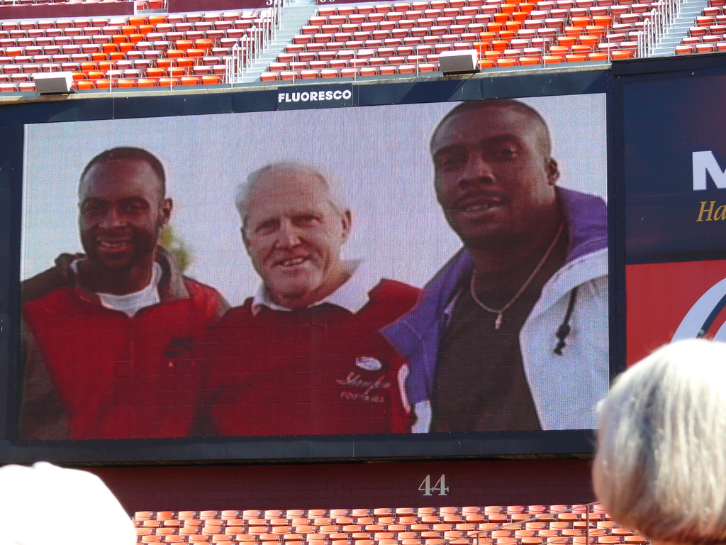
 an amazing 40 assistant coaches have come from bill walsh’s coaching tree and gone on to become nfl head coaches over the past 19 years since walsh retired. plus, another 6 have gone on to become head coaches in college with pete carroll winning 2 national titles with usc and 3 of the 6 being black head coaches (dennis green, tyrone willingham and karl dorrell).


